Where did your eyes go first when you saw the results page? Did they go directly to the title of the first result? Did you first check the terms in boldface to see if the results really talk about tying a tie? Or maybe the images captured your attention and drew your eyes to them?
You might find it difficult to answer these questions. You probably did not pay attention to where you were looking on the page and you most likely only used a few seconds to visually scan the results. Our User Experience Research team has found that people evaluate the search results page so quickly that they make most of their decisions unconsciously. To help us get some insight into this split-second decision-making process, we use eye-tracking equipment in our usability labs. This lets us see how our study participants scan the search results page, and is the next best thing to actually being able to read their minds. Of course, eye-tracking does not really tell us what they are thinking, but it gives us a good idea of which parts of the page they are thinking about.
To see what the eye-tracking data we collect looks like, let's go back to the results page we got for the query [how to tie a tie]. The following video clip shows in real time how a participant in our study scanned the page. And yes, seriously — the video is in real time! That's how fast the eyes move when scanning a page. The larger the dot gets, the longer the users' eye pauses looking at that specific location.
Based on eye-tracking studies, we know that people tend to scan the search results in order. They start from the first result and continue down the list until they find a result they consider helpful and click it — or until they decide to refine their query. The heatmap below shows the activity of 34 usability study participants scanning a typical Google results page. The darker the pattern, the more time they spent looking at that part of the page. This pattern suggests that the order in which Google returned the results was successful; most users found what they were looking for among the first two results and they never needed to go further down the page.

When designing the user interface for Universal Search, the team wanted to incorporate thumbnail images to better represent certain kinds of results. For example, in the [how to tie a tie] example above, we have added thumbnails for Image and Video results. However, we were concerned that the thumbnail images might be distracting and disrupt the well-established order of result evaluation.
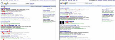
We ran a series of eye-tracking studies where we compared how users scan the search results pages with and without thumbnail images. Our studies showed that the thumbnails did not strongly affect the order of scanning the results and seemed to make it easier for the participants to find the result they wanted.
The thumbnail image seemed to make results with thumbnails easy to notice when the users wanted them (see screenshots below — page with the thumbnail image on the right)...

Click the images to view them larger.
...and the thumbnails also seemed to make it easy for people to skip over the results with thumbnails when those results were not relevant to their search (page with the thumbnail on the right).


For the Universal Search team, this was a successful outcome. It showed that we had managed to design a subtle user interface that gives people helpful information without getting in the way of their primary task: finding relevant information.
In addition to search research, we also use eye-tracking to study the usability of other products, such as Google News and Image Search. For these products, eye-tracking helps us answer questions, such as "Is the 'Top Stories' link discoverable on the left of the Google News page?" or "How do the users typically scan the image results — in rows, in columns or in some other way?"
Eye-tracking gives us valuable information about our users' focus of attention — information that would be very hard to come by any other way and that we can use to improve the design of our products. However, in our ongoing quest to make our products more useful, usable, and enjoyable, we always complement our eye-tracking studies with other methods, such as interviews, field studies and live experiments.